
Whether you love it or hate it, PowerPoint is a fixture of the corporate workplace, and that isn’t likely to change anytime soon. You may not be old enough to remember this, but there was a time when business presentations were done using transparencies laid one by one on an overhead projector. Everyone was happy when Microsoft came out with their Office suite for Windows that included PowerPoint presentation software. No more lugging stacks of acetate to meetings. Now all you needed was a computer and a projector, and you had professional-grade presentations, right?
Well…if you’ve been in any meetings at the office recently, you know things didn’t quite work out that way. While PowerPoint put the tools needed to create great presentations into the hands of the masses, it didn’t turn them all into visual communications experts overnight. Much has been said about the problems using PowerPoint can lead to, so I won’t be covering that here. Instead, I wanted to give you a few simple things you can do to make your next PowerPoint presentation a little bit better.
1. Less is More
There is an uncanny tendency to treat a PowerPoint slide like a document. I’m not sure why. Maybe it’s because so many of us us Word to create documents, and PowerPoint seems so similar at first glance. The problem with giving in to that tendency is that you will produce slides that are dense with text that nobody wants to read off a projector screen.

A PowerPoint deck isn’t the place to reproduce your price list, or to enumerate every feature your competitor’s product doesn’t have. The next time you’re creating a slide to present to your team, your boss, your board, or your customer, resist the temptation to include every scrap of information that might be useful. Instead, think of the 2 or 3 most important things you want them to take away from that slide, and only include those. You can always include the laundry list of items you left out in a document or an email, but the point of a presentation is to present key concepts.
Distilling your message down to include only the critical components will:
- Make your slides less dense
- Communicate key concepts better
- Increase the odds of your audience stay awake
Remember, white space is your friend.
2. Say NO to Clip Art
I’ll probably get some flack for saying this, but the truth can be hard for some people to take. Ready? Ok, here goes. Stop using clip art! Yes, I know PowerPoint comes with a large library of clip art ready to add color to your drab bullet points, but if you don’t want to look like an amateur, follow the lead of visual communications professionals and leave the clip art to your children’s school projects.
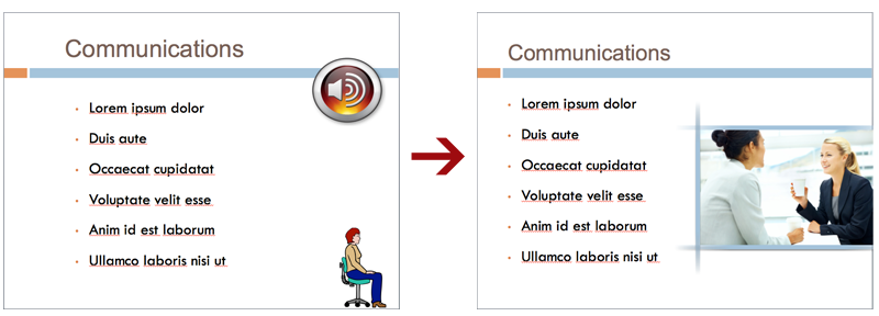
Photographs are a much better options. They can convey emotion, set a scene, and generally tell a story better than any off-the-shelf clip art can. There’s no need to “borrow” photos you find with a Google search, or to arrange a photo shoot in order to get quality images for your deck. There are a number of companies that are ready to sell you professional-grade photos for a modest fee. Have a look at iStockphoto, Shutterstock, and Pond5 to see how good the photos in your next deck can be.
An alternative is to use photos others have taken and released under a creative commons license. This usually means they’re free to use provided you include a link back to the original photo. A good way to search for these is Photo Pin. WHile there are some good images available this way, I’ve found the selection to be smaller, and it can take longer to find the perfect image I need.
One more thing, you may be tempted to use a snapshot you took with your phone or digital camera. This is fine provided it’s a good photo and you have a high resolution version. I can’t tell you how many times I’ve worked on decks others drafted that have very low resolution .jpg images that have been stretched into a pixelated mess. If you want to look like a pro, only use images that are sharp at the size you need them to be on the slide.
3. Think Like a Typographer
OK, maybe you don’t need to think like a typographer, but a little attention paid to the use and placement of type on the slide can go a long way. Here are some simple things you can do to set you work apart.
Pick a font and stick to it: Avoid the temptation to use different typefaces in the same deck. Well, maybe ONE font for titles and ONE OTHER font for the rest of the text is ok. But using more than one or two fonts without some real knowledge of typography only makes your slides look like ersatz ransom notes. Don’t do it!
People mind when things don’t align: Typographers can go on at length about text alignment, expounding on its virtues, it’s rules, and explaining when it’s safe to break the rules. But I know you’re not a typographer, so here are some simple things we can do to improve the look of our slides. Make sure the text in the body of the slide aligns with the text in the title. In fact, it’s a good idea to make sure that all the text in the slide aligns consistently. It’s easy for things to get bumped around in the process of editing slides, so make sure to go back and fix anything that has strayed out of alignment. It sounds like a small thing, but there are subtleties to the way we perceive alignment that cause us to like well-aligned text better. Microsoft includes some handy tools for aligning things under the “Arrange” icon in the ribbon. Try it out yourself and see.
Don’t make the back of the room wish they had a zoom: I know you’re not putting too much text on those slides anymore, so there should be enough room to make sure the text that is on the page is big enough to read from the back of the room. Yeah that subtle, 12pt gray font looks great on your desktop monitor, but consider the folks at the back of the room. Just because they didn’t’ want to sit near you is no reason to make them suffer.
Leave underlining where it belongs — in the typewriter era: Nothing makes a PowerPoint slide look amateurish like underlined text. Have a look at any professionally typeset document you have at hand, like a magazine, newspaper, or book. See any underlined text? Bet you don’t. That’s because they don’t need it. Underlining was a way to emphasize text when the only tool we had was a typewriter. Today, we have the typesetter’s tools at our finger tips — bold, italic, color, size — all of which are better ways to draw attention to a selected portion of text. Yet I see slides with underlined text nearly every day. So do your part in ridding the PowerPoint world of this relic from the past. Whenever you’re tempted to underline something, ask yourself if it wouldn’t be better to use a more sophisticated and professional-looking way to create emphasis
Well, there you have it. Three simple things for you to keep in mind the next time you have some slides to put together. Or try them out on a PowerPoint deck you already have. Either way, if you decide to try out these tips, let me know how it went. Did you notice an improvement. Did others notice too? Bet they did.